
Your typeface is your brand talking before anyone reads a single word. We see it all the time with The Woodlands businesses, you live and die by how fast you carve out an identity that isn't a copy of the shop down the street, and the letterforms in your logo are doing more of that work than you think. Readable. Intentional. Unmistakably yours, that's the bar we hold our work to.

Honestly, typography carries more of the load in a logo than most business owners ever clock. The right typeface tells people whether you're trustworthy or playful or premium before they've consciously processed a single word (BB Director).
A customer in The Woodlands feels something about your company name before they actually read it. The shapes got there first. And the wrong shapes sink you, a sharp clean font reads as confident, a loose handwritten one reads as approachable, but pick badly and a solid business looks like it doesn't take itself seriously. Sound familiar? We watch this happen constantly with local service companies, they paid for great work, then paired it with a typeface that quietly undercuts the whole thing.
Pick wrong and you broadcast signals you never meant to send.
Picture a law firm running a bouncy rounded font (it reads like a birthday invite, not a courtroom). That gap, the one between what you meant and what people see, is exactly where logos fall apart. But a typeface that actually fits? It communicates clean and builds recognition over time, your customers start tying those specific shapes to your specific business, and that connection is worth guarding.
Get honest about your brand's personality first. Formal or relaxed, heritage or forward-looking? Your font answers those questions whether you planned for it or not. Plenty of The Woodlands businesses reach for classic serif fonts, and that tracks for industries where trust and stability are the whole pitch. A newer tech shop, though, usually wants something cleaner and more geometric.
Legibility isn't optional. A gorgeous font that collapses at small sizes is just a liability, full stop. We tell clients to test the logo on a business card mockup and a big format sign before they commit, because a typeface that looks elegant huge can turn into a muddy smear at an inch tall. That's the real test. If it doesn't survive, keep looking.
Here's the thing nobody says out loud: your font is a competitive signal. We switched a home services client off a generic bold sans-serif into something with a little more bite, and the logo stopped blending into every other truck crawling up I-45 overnight. Your font should make you stand out in a crowded market, not just stay legible. Two jobs at once.
Not complicated. Just consistent.

Visual hierarchy is how we steer someone's eye exactly where we want it to go, and size, weight, and color are the tools we use to do that. A logo that tries to say everything at once ends up saying nothing.
Most logo typography problems aren't creative problems at all. They're priority problems. Your eye lands somewhere first, and that somewhere gets decided by size and weight, not by accident, which means the brand name earns the spotlight and the supporting text supports, period. And color pulls focus too. A single tinted word does more work than a whole rainbow ever will.
We see this constantly with local service businesses in The Woodlands who want every brand value crammed onto a two-inch logo, all at once. It doesn't work. Two colors, tops. A tight palette stays readable at any size and memorable after one glance, while too many colors just muddle the message, and a muddled message is the kind nobody remembers.
Your typography is a roadmap. Lay the path on purpose. Get the order right and the message lands, get it wrong and people scroll past before they catch your name.
Creativity is key, but simplicity triumphs.
Complex logos are a liability. Hard to reproduce, brutal to read small, and honestly kind of exhausting to look at. The ones that stick are almost always restrained. A Conroe landscaping outfit or a Spring med-spa gets remembered not because the logo does a lot, but because it does one thing clearly. Take the Nike swoosh, yes, everybody points to it, but that's because it keeps proving itself. One curve. Unmistakable. Your typography works the same way the second you stop asking it to carry everything.
We tell clients clarity is the creative act. Well, not exactly, stripping a design down to what actually matters takes more nerve than piling things on, and most designers learn that the hard way. Sound familiar? If you've ever over-designed something, then felt this wave of relief when you deleted half of it, you already get it. Simple logos beat complicated ones because people remember what they can process, not what dazzles them for three seconds and then vanishes.
Less isn't settling. It's the whole point.
Testing your logo's typography means putting it in front of real people from your target market and actually listening to what they say. You run a round, refine, run another, and the design gets sharper each time.
Once the design exists, get it out of the studio. Show it to actual prospective customers, not your friends, not your family, people who'll meet your brand the way strangers do. And ask blunt questions. Does this logo say what you do? Does it stick? Take the hard feedback seriously, that feedback is what makes the next version worth anything. Your target audience will tell you things your designer and your spouse never will, and those are exactly the things worth hearing.
That's the whole game.
Test it early. We watched this play out last spring with a service business off Research Forest. The owner had fallen hard for the mark, and then four real customers walked in and flagged something nobody at the table had clocked in six weeks of staring at it. That feedback isn't failure, it's the whole point, and the brands loose enough to act on it are the ones still hanging on a decade later. Your logo grows as your brand grows.
Feedback is data. A mechanic in Conroe reads a design one way, a corporate buyer in Houston squints and reads it another, and closing that gap is the actual work. Keep refining. A logo that lasts never shows up perfect. It gets there through iteration and a real willingness to fix what isn't working.
Bold custom lettering, stripped-back minimalist type, variable fonts that flex across screens. We're seeing all of it right now, and these aren't trends for the sake of trends. They help brands feel current and intentional rather than just generic.
Bold custom fonts carve out space in a crowded market, they hand a brand a voice that stock typefaces never could. Honestly, that distinction matters more every year. Minimalist type pulls the other direction, stripping everything back to what actually needs to be there. Both beat the forgettable middle ground of whatever came bundled with your website template.
Variable typography bends. Weight shifts, width adjusts, and the whole thing holds up across every screen your brand lives on. Here's the thing nobody says out loud: a trend that doesn't fit your brand is just noise. Geometric sans-serif took over tech logos for real reasons, and those reasons almost certainly don't apply to your Spring landscaping company.
Chasing trends without a filter is how you end up redesigning every two years. Sound familiar? Ask yourself honestly whether a choice still works in five years. That one question kills a lot of bad decisions. A logo that mixes what's current with what's genuinely timeless stays useful way longer than one that was just following the moment.
Typography mistakes quietly kill logos. Cramming in too many fonts, sacrificing legibility for style, picking a typeface that fights the brand's personality, all of it sends mixed signals that erode trust over time.
Too many fonts is the worst offender. We see this constantly with service businesses around The Woodlands. It fragments the eye, makes a brand feel half-finished. Two fonts is the ceiling, well, one is usually plenty. Readability beats personality every time, because a font nobody can parse at a glance isn't doing its job, no matter how sharp it looks blown up on a billboard out on I-45.
Brand alignment is where I watch this fall apart most. A bouncy, playful typeface on a law firm's letterhead doesn't just look off, it argues with the exact thing the firm is paying to say, and your type carries tone whether you signed off on it or not. A clean face matched to what the brand actually stands for beats a trendy one fighting it. Every time.
These slip-ups do more than look bad. They eat away at trust, they leave the reader guessing, and they make the rest of your marketing pull double shifts covering the gap. Keep it legible. Keep it honest to the brand.
Simple. Specific. Honest.
For typefaces, Adobe Fonts and Google Fonts are where we go first. Between them they cover a wide range of styles, free and premium, depending on what the project actually calls for.
Adobe Fonts is usually our first stop. The library is enormous, running from clean geometric sans-serifs all the way out to ornate display faces, and a Creative Cloud subscription opens the whole shelf. Google Fonts plays a different game. Free across the board, and honestly more than enough for most of what we build. Budget doesn't have to mean boring. We see this constantly with local service shops in The Woodlands who write off free fonts before they've even opened the list.
Font Squirrel is worth bookmarking. It digs up options that haven't already been pasted onto every startup homepage, and the web font generator saves real time on custom builds. When a client walks in with a screenshot and no clue what the font is, WhatFontIs cracks it in maybe thirty seconds. Sound familiar? That's half our intake calls right there.
These aren't scroll-through databases. They're where the actual decisions get made. We pull a handful of candidates, set them at logo size, and watch what holds up. Your homepage earns that kind of slow look, not whatever happened to read well in the thumbnail.
Fonts carry emotional baggage, and we use that intentionally. A condensed sans-serif reads completely differently than an elegant serif, and that gap is exactly where brand personality lives.
People feel a font before they read a word of it. A heavy traditional serif whispers stability, maybe a little history. A clean sans-serif lands modern and approachable. Neither one wins, they're just different tools, and reaching for the wrong one quietly knocks the legs out from under everything else the brand is trying to say. I watched a Spring-area law firm bleed credibility with a typeface that belonged on a food truck menu.
Disney's lettering is the easy one. The whimsy is fully on purpose and you can't pry it loose from the feeling of the brand. But your shop doesn't have to be Disney for this to count. A Conroe HVAC company signaling that it's been around and can be trusted should be reaching for something very different than the guy down the same street shouting low prices and same-day turnarounds. Same industry. Different message.
Here's the part nobody says out loud. Most logo font choices get made on a gut feeling and never tested against anything. We push back on that. Well, not exactly push, we just keep asking why. The typeface you land on is doing quiet psychological work on every person who reads your sign, your truck, your invoice. That work should be a decision.
A logo works best when typography isn't sitting in isolation from everything around it. We treat type, imagery, and color as one system, because brand identity only comes through clearly when those pieces feel like they were built together from the start.
Typography never lives alone. It sits inside a whole design ecosystem, and the typeface you pick has to get along with color and spacing instead of shoving them aside. We say this on every kickoff call. A logo that feels "off" is almost always one where those pieces aren't talking to each other, and once they finally click you get something that looks deliberate without looking like it strained for it.
Balance is the whole game here.
Strong logo, type and symbol prop each other up. Neither one grabs. Harder than it sounds, and a Woodlands retail brand we rebuilt last year had a gorgeous mark that kept drowning under a fussy secondary typeface, so we stripped it back and the whole thing suddenly read as one piece instead of two fonts brawling.
Color feeds in too. The right hue on the right letterform adds depth, but it can also wreck legibility the second you glance away. So ask whether each element earns its spot or just decorates. Your typography carries the story. Not fill space beside it.
Your logo shows up everywhere. A site header, a yard sign in Spring, a folded brochure abandoned in some Conroe waiting room. Each spot plays by its own rules, and a typeface that sings on a billboard can crumble at 32 pixels on somebody's phone.

Look, people underestimate screen resolution, and we watch it bite service businesses around The Woodlands and Conroe over and over. Thin serifs that look elegant on a printed card turn to blurry mush on lower-res displays. So we nudge clients toward cleaner, more structured type when digital comes first. Then the color profile thing hits. Print runs CMYK, screens run RGB, and if you didn't plan for that handoff your brand's signature color shifts between a business card and a Facebook avatar. Not a disaster by itself. But that drift quietly eats at trust, and nobody ever tells you that's why they stopped calling.
Simple and bold wins from a phone screen to a wrapped truck. Keep it tight. Adaptability mostly sorts itself out after that.
Our post on Timeless Logo Design Elements That Last covers the next layer of this.
Honestly, it's one of the first things people read, literally and emotionally. A typeface sets a tone before anyone consciously notices it. A sharp geometric sans says something wildly different than a hand-lettered script, and your audience catches that gap the instant the font and the brand stop agreeing. Get the typography right and the rest of your identity has ground under it.
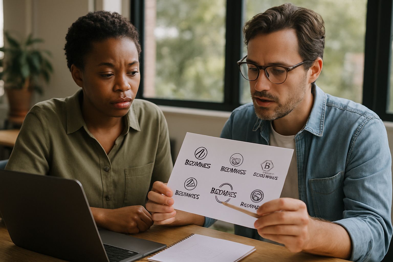
You can use more than one font in a logo, but we almost always cap it at two. Go past that and the visual harmony falls apart fast.
Two fonts, chosen on purpose, hand you personality and hierarchy without smearing the mark. But "on purpose" is carrying that whole sentence on its back. Sound familiar? I see logos around Spring and Conroe where somebody fell for two typefaces separately, loved each one, and then jammed them together so they sit there like strangers at a bus stop. The test is dead simple. Does the pairing read like a decision or an accident.
The most common slip-ups are piling on too many typefaces, letting style bulldoze readability, and grabbing a font that has nothing to do with what the brand actually stands for.
Here's the part nobody says out loud. Bad type splinters your message in about four seconds, and once a reader stops trusting what they see, there's no second handshake. Keep it clear. Keep it honest to how your brand actually talks, and you've handled most of the job before you've started.
Put it in front of real people and shut up and listen. Not your business partner. Not your spouse, who will tell you it's great because dinner's getting cold. People who actually look like your audience, the ones who'd hire you on a Tuesday. We push clients to gather reactions early, because a mark that sings on a 27-inch monitor can fall apart on a billboard off I-45 and look even worse on a cracked phone screen. Sound familiar? Take what they say, sharpen, run it again. The loop never fully closes. It just tightens.
Here's the part nobody says out loud.
Trends are a doorway, not the room. Bold custom lettering and variable fonts are worth a look right now, but chasing one without asking if it fits your brand is exactly how you end up paying to rebuild the same logo eighteen months later. A Woodlands HVAC outfit and a downtown Houston law firm scroll the same design feeds, and they need completely opposite answers.
Borrow from what's current. Bolt it to something that won't curdle by next spring. Minimalist type survives at small sizes and ages slow (which is the whole reason it keeps circling back), but only when it sounds like who your brand really is. So drag the trend toward your brand. Don't follow it out the door.
Look, our team in The Woodlands works with local businesses across Spring, Conroe, and Houston. And I've watched strong typography quietly turn into the thing that keeps a brand lodged in someone's head long after they've closed the tab. Well, not quietly, exactly. It does the work nobody notices. If your current site or logo feels like it's pulling against you, let's talk. Start with a conversation.
LATEST POSTS


