
Shoppers in The Woodlands will leave a cart the moment something feels off, and it usually comes down to trust. Hidden fees, a checkout that fights them at every step, vague policies, none of that flies when the next tab is already open. We have to make the price clear, the process obvious, and the security unmistakable, or they're gone.

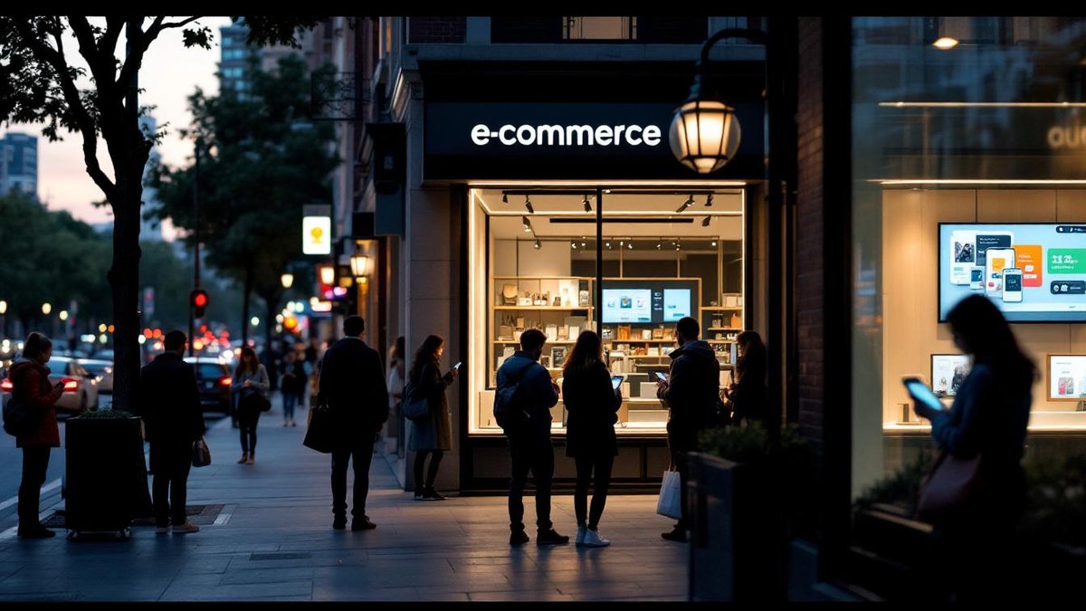
Every online store faces this. Customers browse, pick what they want, then vanish before they ever hit "place order." We see it constantly with local service businesses and e-commerce shops alike, and it's not a mystery once you know where to look. Here's what's actually driving it, and what you can do right now.
Surprise charges, especially shipping costs that appear late in checkout, are the fastest way to lose a sale. Show every fee upfront, because shoppers who feel ambushed don't complete orders, they just leave.
Sound familiar? Your customer finds exactly what they want, drops it in the cart, starts checking out, and then a shipping fee appears out of nowhere. Done. Gone. The Baymard Institute found that 48% of shoppers bail because of unexpected extra costs, and honestly, that number doesn't surprise us at all. We've seen it wreck otherwise solid stores.
Show the full price early. Shipping, taxes, fees, all of it, before anyone is three steps deep in a form. Free shipping is great if you can swing it, but a flat rate or a free-shipping threshold works too. (That threshold also quietly nudges people to toss one more item in the cart, which is a nice lift for average order value.) Give people the real number and they're far more likely to follow through.
Tax transparency matters more than most store owners realize. Use geolocation tools to surface an estimated total early in the process. Shoppers in The Woodlands, Spring, and Conroe aren't waiting around for a surprise at the end. That's not how trust gets built.
A long, complicated checkout is friction, and friction kills conversions. Cut the steps down, let people check out as guests, and watch more of them actually finish.
Look, nobody wants to fill out six screens of forms just to buy a candle. Here's the thing nobody says out loud: a lot of store owners built their checkout around what's convenient for them, not for the person buying. A Statista survey found that 21% of shoppers bail specifically because the checkout drags on too long. That's fixable. Cut unnecessary fields, trim the steps, and offer guest checkout. Forcing account creation before a first purchase is one of the most reliable ways to lose a sale we've ever seen, and we see it constantly with local shops that are otherwise doing everything right. Speed matters, but so does not making your customer feel like they're applying for a mortgage.
Apple Pay nails this. A fingerprint or a face scan, and you're done. That speed tightens security too, which makes people way less nervous about actually hitting buy.
For most local businesses, the fix is simpler than you'd think. Drop in PayPal or Google Pay so your returning customers aren't re-typing card numbers every single visit. Then go audit your form fields, cut anything that isn't genuinely required. Does your checkout really need a phone number, or is that just leftover habit from some old template? Trim it. A leaner form converts better, pretty much every time.
Not complicated. Just consistent.
Your checkout layout earns real attention too. A clear flow with a progress bar, something that tells people "step 2 of 3," kills the anxiety of not knowing how close they are to finishing. We see this constantly with local service businesses that treat checkout like an afterthought, it shows, and it costs them.
Here's the thing nobody says out loud. If your site looks like nobody's touched it since 2014, shoppers are gone before checkout ever loads. Security doubts rank among the most common reasons carts get abandoned, and a surprising share of people bail specifically because handing over payment info feels risky.
Put your security badges where people actually see them, run SSL, write your return and privacy policies in plain language. And don't bury them under a footer link labeled "Legal." Your customers want to know their data is safe, they want to know you'll deal fairly if something goes sideways. Honestly, a lot of businesses just assume shoppers trust them by default, and that assumption kills conversions.
We've watched businesses lose customers purely because the site offered nothing reassuring. A padlock icon and silence isn't a strategy. One Woodlands retailer we worked with added a straightforward 30-day return policy right next to the add-to-cart button (so nobody had to go hunting for it), and abandonment dropped almost right away. That kind of openness separates you from competitors who just hope for the best.
HTTPS is non-negotiable. It protects customer data, and it signals to Google that you're running a credible operation, which matters for your rankings. But go past the technical side and actually say something to your customers about security. A plain line like "Your payment info is always protected here" works, mostly because most sites say nothing at all. And when you update your security setup, don't treat it like some internal IT event. A quick note to your customers goes further than you'd expect.
Two-factor on account logins is worth adding. Yes, it's one extra step. But shoppers who feel protected come back, shoppers who feel exposed don't. Sound familiar? Give people a reason to feel safe and they'll give you a reason to keep your site running.
If someone's preferred payment method isn't there, or the payment step throws an error, that cart's gone. Offer a solid range of payment options, and test the whole thing before it goes live.

Payment problems kill sales fast. One missing option, a single checkout error, and the whole transaction stops cold. If a customer can't pay the way they want, they're gone. They'll find a competitor who makes it easy, and we see this constantly with local service businesses that set up their store once and never look at it again.
Accept credit cards, PayPal, Apple Pay, at minimum. And test the checkout on a real schedule, not just after a launch or update. Routinely. Because the only thing worse than a broken payment flow is finding out it's been busted for three weeks because some angry customer finally emailed you. Honestly, that's how most people discover the problem.
That's the whole game.
Shopify built its platform around solving exactly this. It supports multiple payment gateways, so merchants can take payment in almost any form from almost any market, which matters a ton when your customers have wildly different banking habits. You're trying to reduce friction at the exact moment someone's ready to pay. That's the worst possible time to throw up an obstacle.
Here's the thing nobody says out loud: by the time a customer hits a payment error, they've already bought the product in their head. The barrier feels personal. Keep a backup payment method ready (don't sit on it hoping it fixes itself), and if something breaks, contact support right away. How you handle a payment problem tells customers everything about how you run the rest of your shop.
And internationally, local payment options aren't optional. Alipay in China, iDEAL in the Netherlands, these aren't niche workarounds. They're how millions of people actually pay. Skip them and you're leaving real conversions sitting on the table, with customers who were ready to buy.
A slow site or a checkout that breaks on mobile will cost you sales every single day. Speed matters, and so does a layout that actually works on a phone, because that's where a lot of your customers are shopping.
Slow sites lose customers before the page even finishes loading. Sound familiar? Mobile users have zero patience compared to desktop, and if your site isn't dialed in for a phone, you're handing those sales straight to the competitor who got it right. Google says 53% of mobile users bail on sites that take more than three seconds to load. Three seconds. And a lot of sites here in The Woodlands and Houston still aren't clearing that bar.
Look, the fix is pretty much the same every time. Compress your images, cut the code bloat, pick hosting that won't buckle under real traffic. Then test on the actual phones your customers carry, not just the desktop sitting in your office. A fast site that's clunky on mobile still drives people off. Speed and usability are the same problem.
One of our clients shaved a single second off their mobile load time and conversions went up. That's it. One second. We point people toward a content delivery network first, then run pages through Google PageSpeed Insights to see exactly where the slowdown lives.
But speed is only part of it. Design does just as much work. Big tap targets, short forms, calls to action that don't make you squint. And test on a real phone, because a layout that looks sharp on your desktop can completely collapse on a mid-range Android.
Accelerated Mobile Pages load fast by stripping everything down to what actually matters. Not every site benefits. For high-traffic product pages, though, especially around The Woodlands where people are browsing on their phones while waiting in a school pickup line, it genuinely moves things.
Simple. Specific. Honest.
Checkout is not the place for popups, promotions, or anything that pulls attention sideways. Keep it clean and focused, one job only, get the order through.
Here's the thing nobody says out loud: a lot of businesses lose sales they already won. The customer found the product, added it to the cart, pulled out their card, and then a popup appeared. A banner needed closing. An upsell slid in from the side. And they left.
Pull anything off that page that doesn't directly move someone toward completing the purchase. Nothing extra. We see this constantly with local service businesses and e-commerce shops alike, the checkout page becomes a dumping ground and it quietly kills the conversion rate.
Clean checkouts, order summary, payment, shipping, nothing else, outperform cluttered ones every time we've tested it. Sound familiar? If your checkout has more than three decisions to make, that's probably worth fixing this week.
Upsells and cross-sells belong earlier in the funnel. At the final step they yank focus at exactly the wrong moment. Confirm the order, make payment simple, done. Put additional offers on the confirmation page, after money has already changed hands.
And don't underestimate the psychology of small things. A security badge near the payment button, a one-line testimonial (something like "easy checkout, arrived fast"), these quiet trust signals reduce hesitation without adding visual noise. They just work.
Shoppers want to know what happens if something goes wrong before they hand over payment. Make your return and refund policies easy to find and plain to understand, and you remove a real reason people hesitate.

If your policy is buried in the footer or written in language a lawyer drafted for a courtroom, shoppers will pause right before buying and then close the tab. We tell clients in Spring and Conroe the same thing we tell everyone: people spend money confidently when they know they're not trapped. Plain language builds that confidence fast.
Put the policy somewhere visible. Write it like a person wrote it, not like a terms-of-service document. Most shops bury this and it costs them sales on the last click before checkout.
Not every business can offer a no-questions-asked return window, and honestly that's fine. Clarity and fairness get you most of the way there. Shoppers aren't looking for a guarantee, they're looking for a straight answer about what happens if the product doesn't work out.
Link your return policy from every page, footer at minimum. An FAQ format works well here. The more open you are, the more trust you build, and trust is honestly what moves people through checkout, not clever copy or a slick design.
A prepaid return label costs almost nothing. But it signals confidence in what you're selling. Customers who feel good about returning something come back, not once, repeatedly, and that loyalty compounds faster than any ad spend will.
Show someone products that actually match what they want and they stay longer, bail less often, and finish checkout at a measurably higher rate. Personalization does real work, it's not a someday feature.
Here's the thing nobody says out loud: most shops are still blasting the same message to their whole list, then wondering why conversions sit flat. We see it constantly with e-commerce clients in The Woodlands and across the Houston area. The shops using behavioral data beat the broadcasters every time, it's not complicated, it's just paying attention.
Match the shopping experience to how someone actually behaves and you close the gap between browsing and buying faster than pretty much anything else. People don't want to feel processed. Show them something relevant and they feel seen (that feeling matters way more than most shop owners realize).
Start with email campaigns aimed at the people who left without buying. Reference what they actually looked at, not some generic "you forgot something" blast. Then segment by purchase history and browsing patterns. The narrower the segment, the more relevant the message, and relevance is what earns the click. A note saying "you viewed this, here's 10% off" gets opened. A form letter doesn't.
Retargeting ads run on the same logic. Someone who left your site already showed interest, they just didn't finish. Retargeting puts the exact product they viewed back in front of them while they browse somewhere else. Pair that with a personalized email sequence and you cover two touchpoints instead of one. And most shops pick one or the other. Running both is how you pull back carts that would otherwise vanish.
AI tools put behavioral analysis in reach of small retailers now, not just the big-box operations. They track how people move through your site, then start predicting what they'll want next. Feed that into your recommendation engine and your emails stop feeling random. Sound familiar, that inbox full of stuff you'd never buy? That's exactly what you're avoiding. When the recommendations get accurate, conversions follow.
Sometimes a shopper just has a question, and if nobody answers it, they leave. Live chat and responsive support during checkout can catch that hesitation before it turns into an abandoned cart.
Look, a lot of cart abandonment has nothing to do with price or checkout friction. It's an unanswered question. Sizing, shipping time, whether returning something turns into a nightmare. A customer who can't get a fast answer won't hang around, they'll go buy from whoever makes it easy, and your Spring or Conroe competitor is one tab away.
Live chat fixes this directly. Put it on product and checkout pages where decisions actually happen, not buried somewhere in a contact section nobody finds. Customers get answers fast, doubts don't pile up, and the sale stays alive. We've seen it shift conversion numbers meaningfully for clients who made the switch.
Think about what it takes to buy a mattress online. That's a real commitment, and people have questions at 11pm when no one's around. Having chat available around the clock removes that hesitation, customers who aren't sure help exists simply won't follow through. That uncertainty is what you're killing when you make support visible and accessible.
Your support team has to know the products cold. Not just the specs, the edge cases. The weird questions people ask while sitting on the fence at midnight. Train them on common objections, payment hiccups, shipping windows, return policies. A rep who stumbles on something basic loses the sale and probably the customer for good. But someone who resolves a concern in under two minutes can flip abandonment into a completed order.
Bots handle the volume problem pretty well (honestly, a lot of shops underuse them). Order status, return policies, sizing guides, none of that needs a live person every time. Set the bot up for the common stuff and route anything complicated to your team. Response times drop, your people focus on real problems, and customers get answers at any hour without you hiring for every traffic spike.
Trust closes sales. For anyone landing on your site for the first time, the fastest way to build it is showing that real people already bought and liked what they got. Reviews and ratings answer the question a visitor is quietly asking before they'll ever ask it out loud: is this actually worth it?
Sound familiar? Travelers don't trust hotel marketing copy, they trust other travelers. E-commerce works the same way. If your product page has a couple hundred reviews, a strong average rating, and photos from real customers, a new visitor arrives with context they didn't get from you. That context does more conversion work than almost anything you write yourself. Make leaving a review effortless, ask happy customers directly, and display what you collect up front where people see it. Not buried in a tab at the bottom of the page.
This part trips people up.
User-generated content goes further. When customers in The Woodlands, Houston, Spring, or Conroe share photos or video of your product in the real world, it does two things at once. It proves the product exists and actually ships, and it shows what ownership looks like. Pull that content onto your product pages and social feeds. In markets where word-of-mouth still drives a lot of local purchasing decisions, that kind of peer signal carries serious weight in digital spaces too.
Build a simple review request flow. After a purchase, follow up and ask for a rating and some feedback. It gives future customers something to trust and gives you honest signal on what's working and what isn't.
Cart abandonment in The Woodlands market isn't one problem, it's several landing on the shopper at once. Fix the transparency, simplify the flow, earn the trust, and keep the site fast, those four things handle most of it.

There's no magic button for cart abandonment. Surprise costs, a clunky checkout, weak trust signals, slow load times, too many distractions in the flow, payment options that don't match what your customer actually reaches for, it all stacks up. We tell clients to treat checkout like a living thing, something you watch, adjust, then watch again.
Keep testing. Seriously, that's it.
Pull up your analytics and find where people are actually leaving. The shipping reveal? The account wall? The payment screen? Once you know the drop-off point, you can run A/B tests on that exact moment instead of guessing. And we see this constantly with local service businesses, they redesign the whole site when the real problem is one stubborn form field.
Carts get abandoned everywhere in e-commerce, honestly it's the norm. The shops that close the gap are the ones paying attention to why it happens, not just that it happens. Fix the causes and the revenue follows.
Related reading: Ecommerce Website Mistakes Small Businesses Make.
Most abandoned carts come back to the same short list: unexpected costs, a checkout that's too hard, and a site that hasn't earned the shopper's confidence yet.
People bail when fees show up out of nowhere, when the checkout drags, when something about the site just feels off. Sound familiar? Tighten those areas and you'll move the needle faster than almost anything else.
Put every cost, shipping, taxes, fees, right where people can see it early, and if free shipping is on the table, lead with it because it genuinely moves the needle.
Show people what they'll actually pay before they ever hit checkout. Got free shipping? Put it front and center on the product page, not tucked in the footer where nobody looks (we've seen that mistake more times than we can count).
Every extra step in checkout is a chance for someone to bail, so keep it short, and always give people the option to buy without creating an account.
Forced account creation kills conversions. Ask for the minimum you actually need, let people check out as guests, get them to the confirmation screen fast. Every field you remove is a reason to stay.
Security badges, SSL certificates, and policies that are actually easy to read all do the same job: they tell a shopper it's safe to buy here. And that reassurance has to be visible, not buried.
Here's the thing nobody says out loud: shoppers make that trust call in about two seconds. Your return policy, your SSL indicator, your reviews, none of it can take any hunting to find. Bury them in the footer and people pretty much won't find them when it matters.
More purchases happen on a phone now than on a desktop, and a slow or jumbled mobile checkout is just a dead end for your customer. Fast, responsive sites keep people moving toward the buy button instead of away from it.
We've generated over $50M in client revenue across The Woodlands, Houston, Spring, and Conroe. That 5.0-star rating across 62 reviews? It reflects what we actually do for the businesses we work with. Want to see how that applies to your shop? Reach out and we'll take a real look at where your checkout is losing people. Start with an expert review.
LATEST POSTS


